Discover our brand system to communicate consistently and effectively.
New Identity. Unlimited possibilities. Let's get some work done!
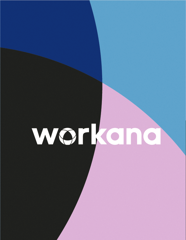
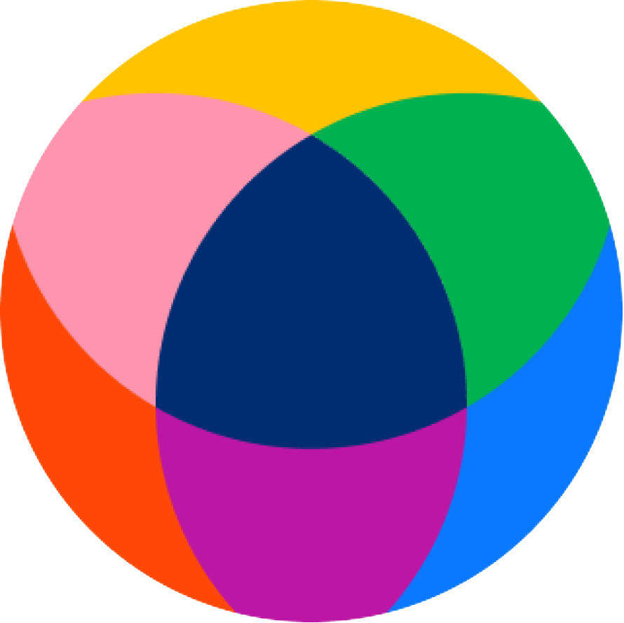
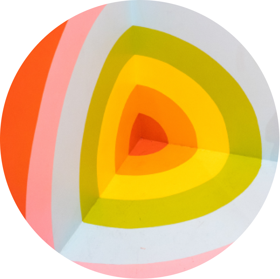
The ring is one of the key elements of our brand building.
It is our unifying element, so it has a huge presence in all communications. Here we will see how to use it.
Ir represents the community through 3 pillars that come together in one form.


The logo is another key piece to generate unity and coherence between communications.
It can be used in it’s color version or in it’s monochrome version according to the needs of each application.
Negative version
Mono version
for use in avatars, profile pictures, and other elements where space for brand is limited.
Follow these rules and you will be able to communicate Workana here, there and beyond.
We are simple
Not plain
We are informal
Not irresponsable
We are approachable
Not gullible
We are trustworthy
Not arrogant
Make sure each word informs and encourages
Simple, empathic and smart
We value clarity above all else.
We speak in a familiar, warm and accessible way. We are on your side.
We believe in the entrepreneur force and the power of the ideas.
We are proud of what we are offering and believe in the power of the new work era.
Smooth and subtle. It's a wink. You can have fun when it's appropriate and when it's natural. Don't force the "joke", that can be worse than nothing.
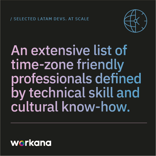
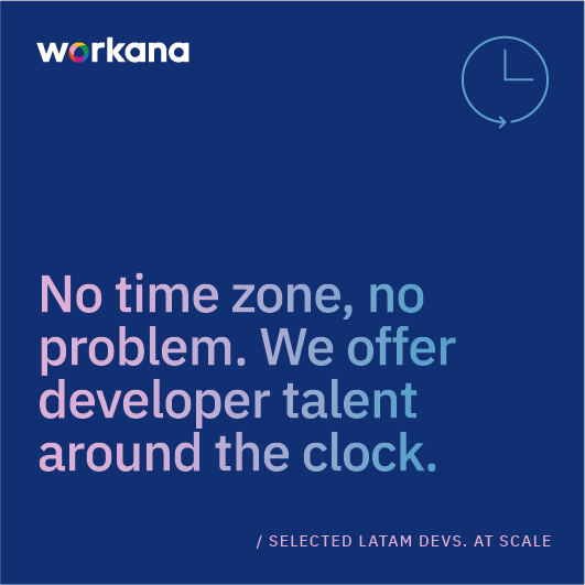
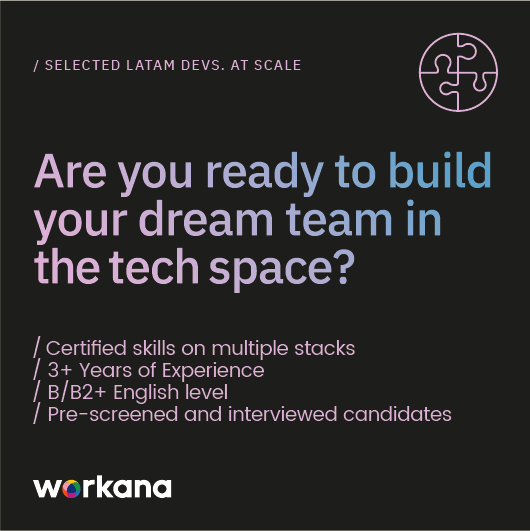
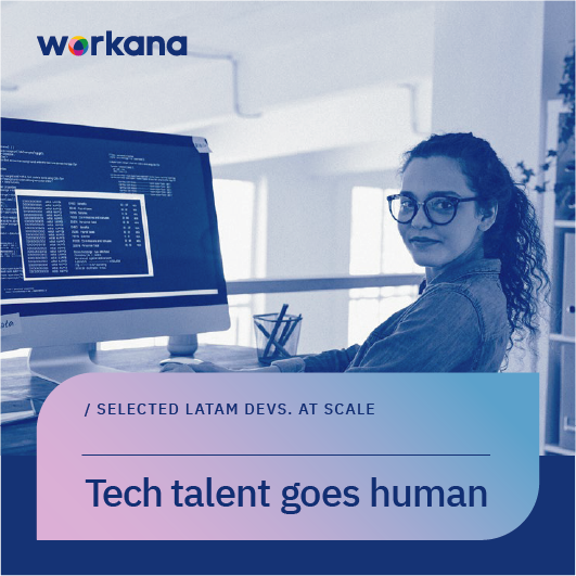
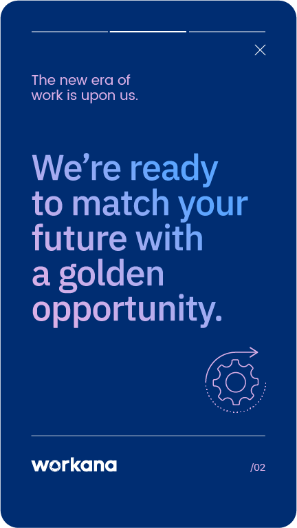
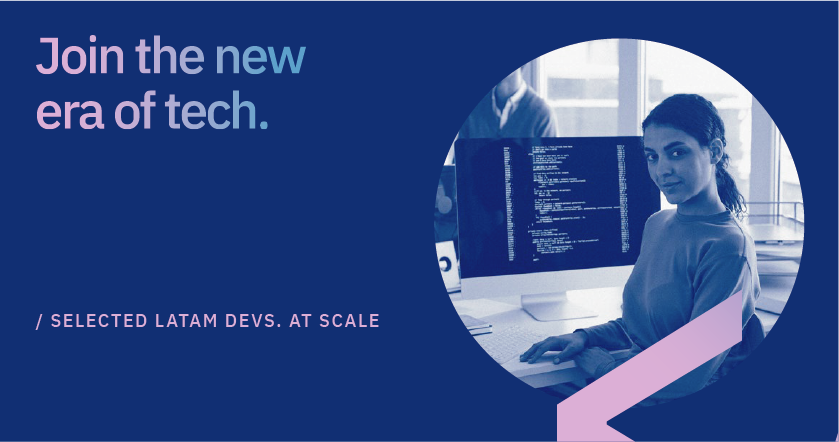
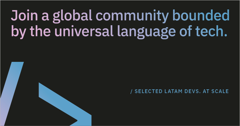
We’re a selected group of Latin American developers bounded by the universal language of tech. An extensive list of time-zone friendly professionals defined by technical skill and cultural know-how. We’re careers, not one-offs. We’re a steadfast commitment, not a side hobby. We’re a certified way to scale rapidly without compromising quality.
We match diversified dev profiles with the world’s best startups
We match unique skill sets with specialized tech stacks
Complex tasks with simplified ways of working
Dream pipelines with dream teams
Startup mentality with elite developers
We’re software treasure hunters, matching opportunities with hidden gem talent.
Because it takes a team of problem-solvers to transform teamwork
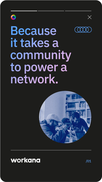
Because it takes a community to power a global network.
This is your opportunity to drive unmatched growth for your business.
Workana. Selected Latam Devs. At Scale.
Expertise and professionalism reflected in a reduced and specific palette that arises from the original identity.
With hard contrasts and inspired in the tech world, this palette does not lose warmth and gains conceptual strength from minimalism.
BACKGROUND
#FFFFFF
R: 255
G: 255
B: 255
C: 00
M: 00
Y: 00
K: 00
BACKGROUND
#1D1D1B
R: 29
G: 29
B: 17
C: 38
M: 35
Y: 33
K: 92
PANTONE BLACK 7 C
BACKGROUND
#002D72
R: 0
G: 45
B: 114
C: 100
M: 87
Y: 32
K: 13
PANTONE 288 C
We use them as a complement or accent on the main colors. They have a lot of presence in content and digital pieces. All these colors can be used with the logo in its color version.
OVER DARK COLORS
#DCB0E7
R: 220
G: 176
B: 231
C: 2
M: 32
Y: 0
K: 0
PANTONE 243 C
OVER DARK COLORS
#5CA5FF
R: 92
G: 165
B: 255
C: 68
M: 34
Y: 0
K: 0
PANTONE 279 C
OVER LIGHT COLORS
#86319B
R: 134
G: 49
B: 155
C: 53
M: 99
Y: 0
K: 0
PANTONE 513 C
OVER LIGHT COLORS
#0053B8
R: 0
G: 83
B: 184
C: 100
M: 52
Y: 0
K: 0
PANTONE 2935 C
Formed by the two brightest colors of the palette, the Gradient brings us even closer to the tech world and provides another way of hierarchizing information.
It will be applied on headlines and simple shapes, avoiding its use on extensive backgrounds.
To ensure contrast and legibility, it must only be applied on the three institutional colors that do NOT form it:
#FFFFFFFF / #002D72 / #1D1D1B
> and it MUST NOT be use on the two tones from the logo:
#0A78FF / #dcb0e7

Never over #0A78FF nor #DCB0E7
Always over #002D72 / #1D1D1B

Never over #0053B8 nor #86319B
Always over #FFFFFF
The objective is to softens and naturalize the communication of digital pieces, bringing it closer to the tech universe but in a modern and relaxed way.
It should be applied as a superimposed image over the design, with a 10% transparency in OVERLAY mode. It can be used as a separate layer, stepping on the complete design or sectoring its application in specific areas.

Tech inspiration. Monospaced in titles & sans serif in texts. Two modern typefaces with tech style, clear reading and well differentiated features that coexist in any type of composition.
Both typefaces are available at googlefonts:
https://fonts.google.com/specimen/IBM+Plex+-Sans
https://fonts.google.com/specimen/Poppins
ALL CAPS FOR SUBTITLES
Poppins Regular, a clean
& modern Sans Serif font
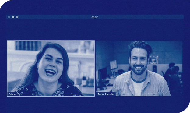
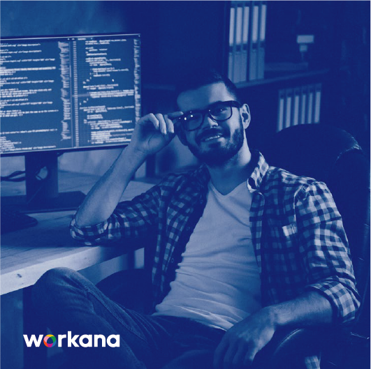
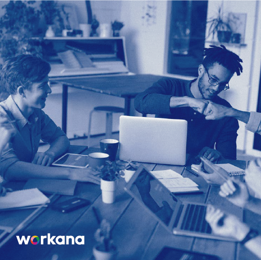
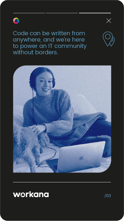
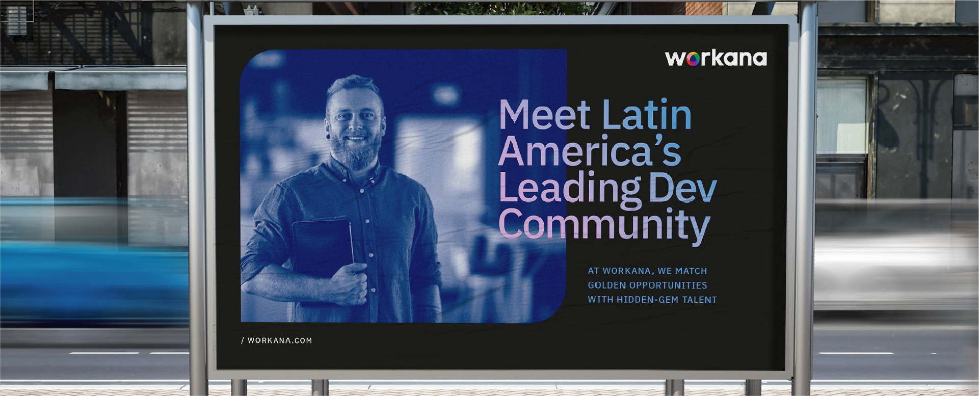
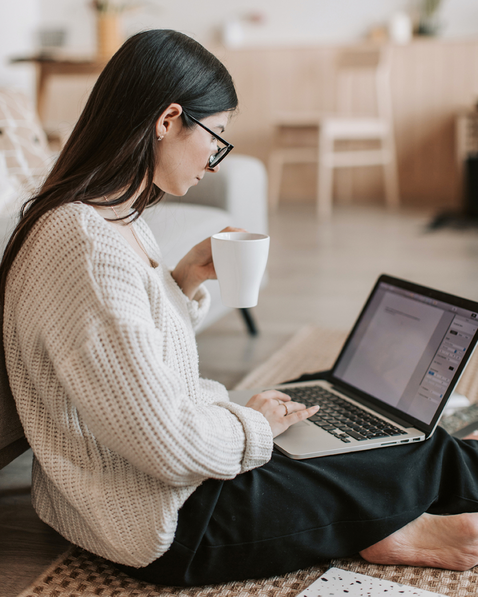
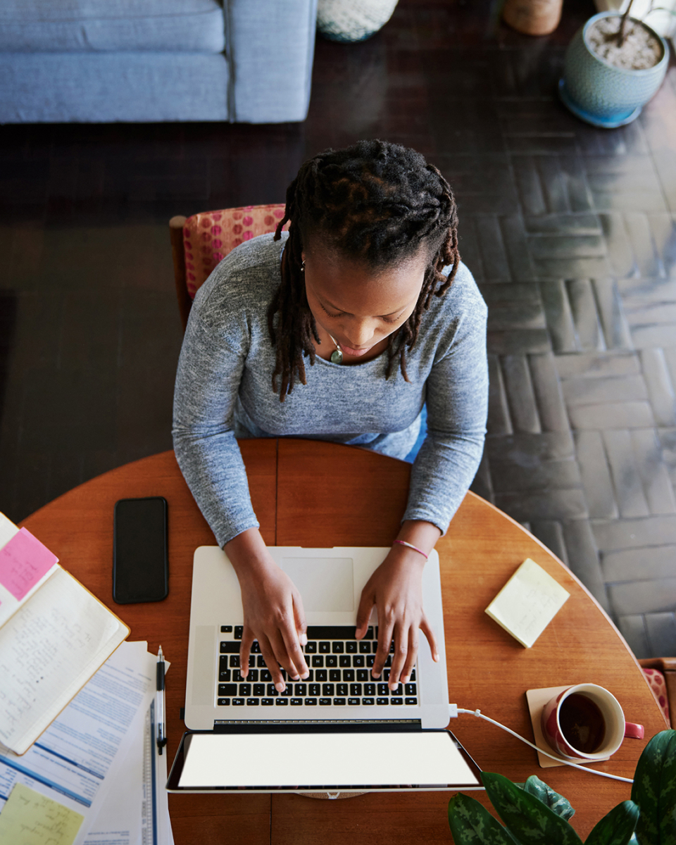
Aspirational images. Professionalism and expertise, in realistic contexts.
Portraits of people looking at the camera showing their willingness and enthusiasm to work are used to generate a warm and close approach.
Group situations are recommended to talk about community and teamwork.
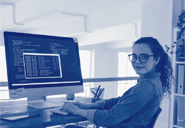


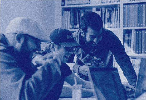
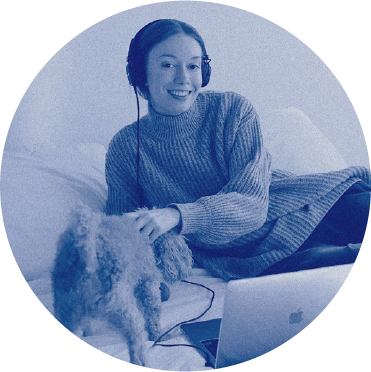
To build consistency, all the images should be published in the following way (or use the developed file to do it):
1 > duotone color mode : #002D72 + #549ffc
2 > Added noise of 7.6%.
3 > Brightness: -5% Contrast: -15%
To ensure an organic identity transition, masks will be kept in three formats:
> Circular
> Rectangular with two opposing corners
Rounded with a radius of 45px
> Square with two opposite corners
rounded with a radius of 45px


Icons enhance the communication of abstract messages when the use of photography is not effective. They also provide communication hierarchies when used with photos.
Simple, geometric and neutral icons will be used, always maintaining a clean line value, so that they can be seen uniformly without losing legibility.
We represent a conversation through the typographic use.
We do it by using 2 fonts with well differentiated
features, which coexist
harmoniously in any
type of composition
Workana is a brand in constant movement. It is made up of a huge, multiple and variable community. Through the circle, we represent that dynamism. The circle contains, represents groups, and acts like a peephole that allows us to observe the Workaner’s universe.


We represent a conversation through the typographic use.
We do it by using 2 fonts with well differentiated
features, which coexist
harmoniously in any
type of composition
We use them to speak institutionally and to generate brand presence. They are the ones that have the most presence in the total system of the brand.
#0a52d9
R: 10
G: 82
B: 217
C: 89
M: 67
Y: 0
K: 0
PANTONE
300U
PANTONE
3005C
#002d72
R: 0
G: 45
B: 114
C: 100
M: 87
Y: 32
K: 13
PANTONE
2495U
PANTONE
288C
#e8e8ca
R: 232
G: 232
B: 202
C: 12
M: 5
Y: 26
K: 0
PANTONE
7527U
PANTONE
7527C
#ffffff
R: 255
G: 255
B: 255
C: 0
M: 0
Y: 0
K: 0
We use them as a complement or accent on the main colors. They have a lot of presence in content and digital pieces. All these colors can be used with the logo in its color version.
#69dab9
R: 105
G: 2018
B: 185
C: 56
M: 0
Y: 38
K: 0
#ff699d
R: 255
G: 105
B: 157
C: 0
M: 72
Y: 8
K: 0
#5a85ff
R: 90
G: 133
B: 255
C: 69
M: 49
Y: 0
K: 0
#ffeb90
R: 255
G: 235
B: 144
C: 1
M: 5
Y: 53
K: 0
#ff9655
R: 255
G: 150
B: 85
C: 0
M: 51
Y: 68
K: 0
#748af3
R: 116
G: 138
B: 243
C: 62
M: 47
Y: 0
K: 0
#38d3ec
R: 56
G: 211
B: 236
C: 62
M: 0
Y: 12
K: 0
#8beaff
R: 139
G: 234
B: 255
C: 43
M: 0
Y: 6
K: 0
#dcb0e7
R: 220
G: 176
B: 231
C: 19
M: 37
Y: 0
K: 0
#bde63d
R: 189
G: 230
B: 61
C: 35
M: 0
Y: 85
K: 0
We represent a conversation through the typographic use.
We do it by using 2 fonts with well differentiated
features, which coexist
harmoniously in any
type of composition
Poppins as secundary font. Geometric and perfect, ideal for small text, details and screen text.
Poppins is available as web font from Google. So no need for a replacement :)
They can be combined, respecting information hierarchies.

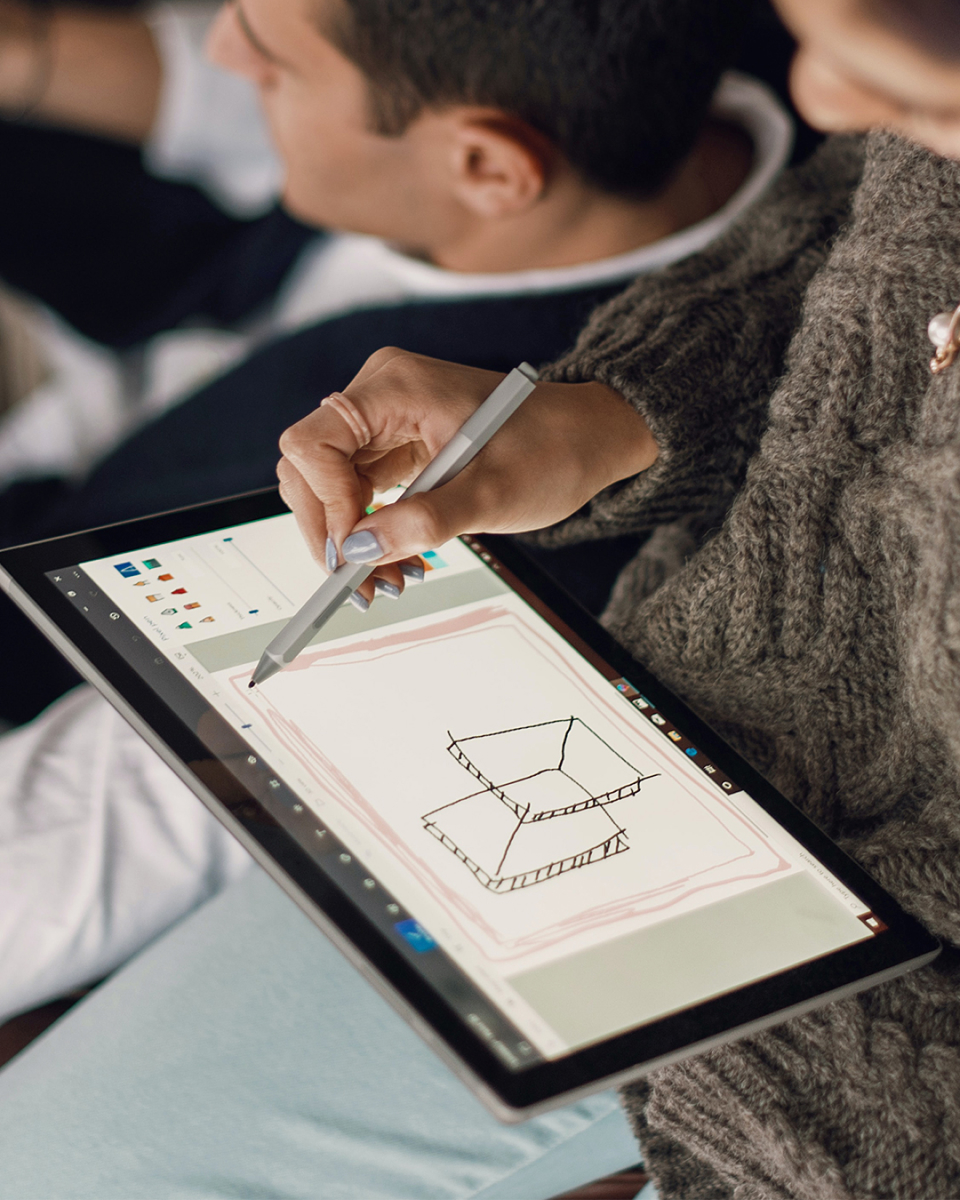
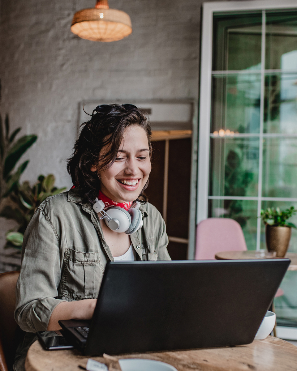
Transform freelancers in aspirational talent.
We use 3 photographic
variables to show our users. One focused on the moment of creative action, and
another that works as a
portfolio.
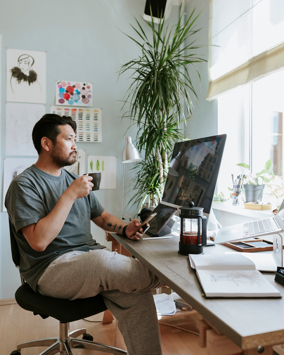
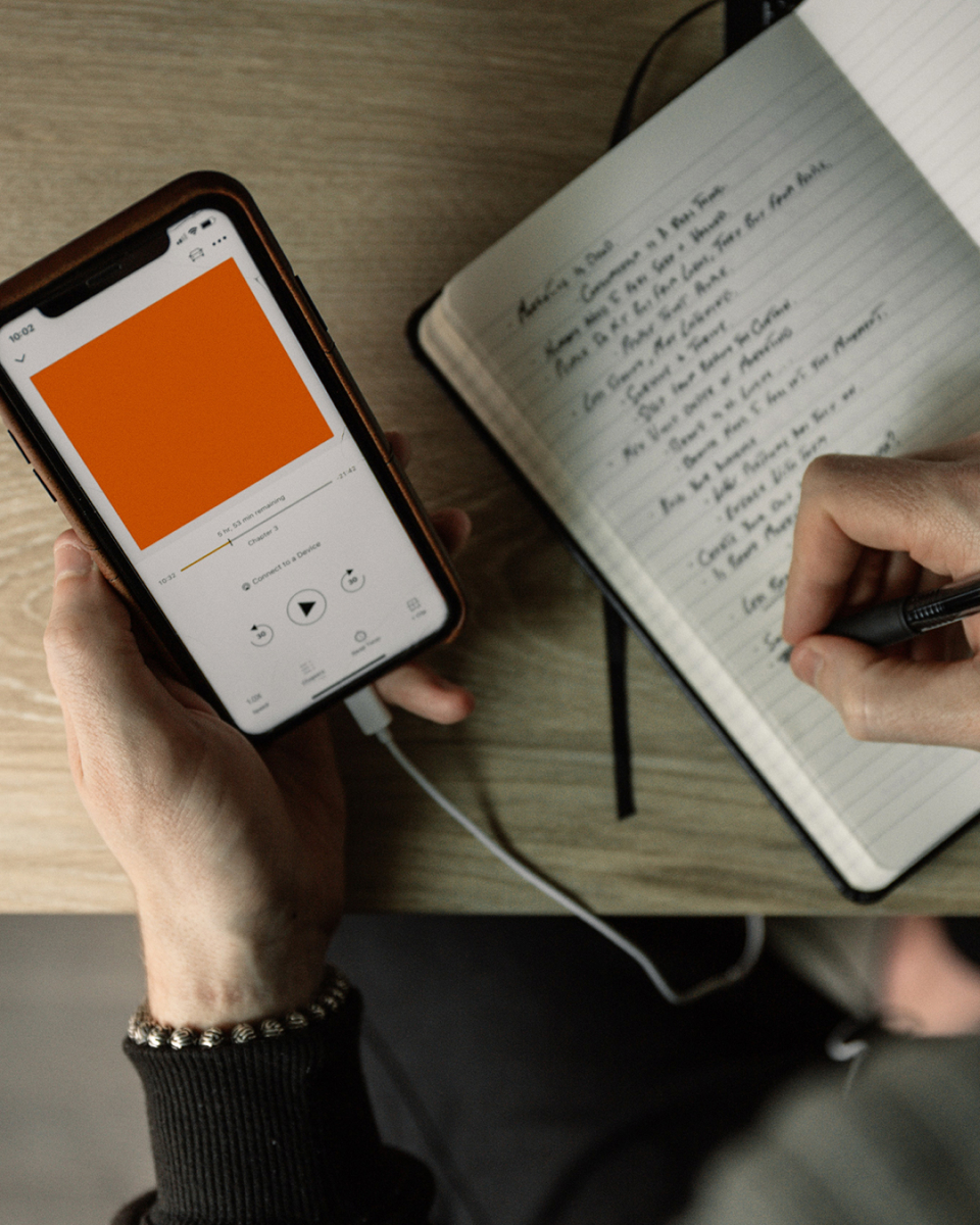
Focus on context and different workspaces, where
work happens.
Houses, rooms, workshops, cafes, surrounded by plants or
next to your favorite pet, from the bed or the couch.
Wherever you are, we are with you.

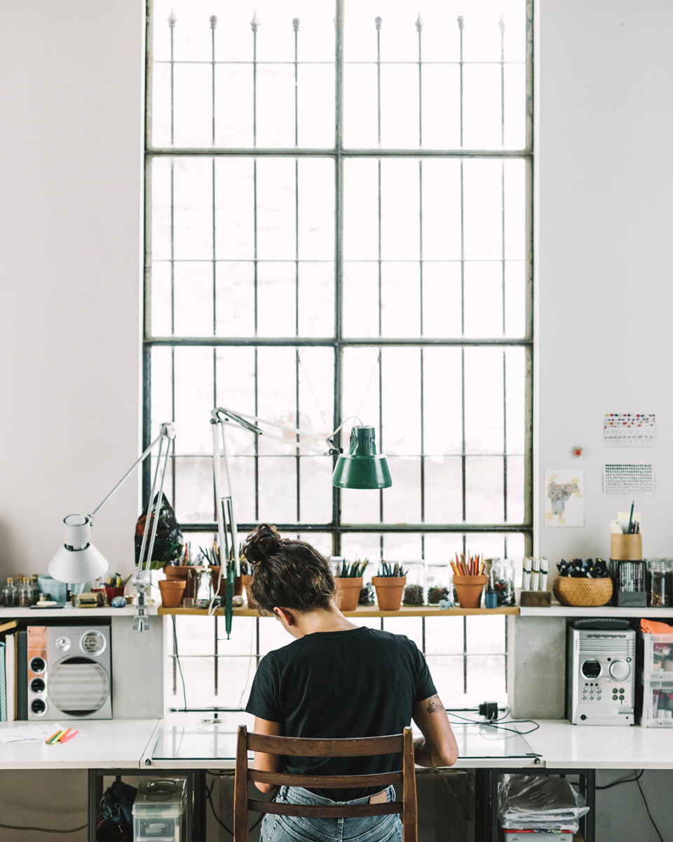

We are interested in showing the
work done by
independent talent.
Images that show details of the creation process, finished works, work tables.
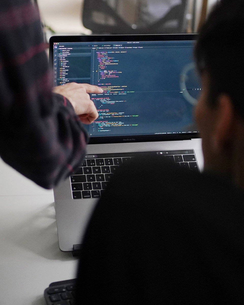
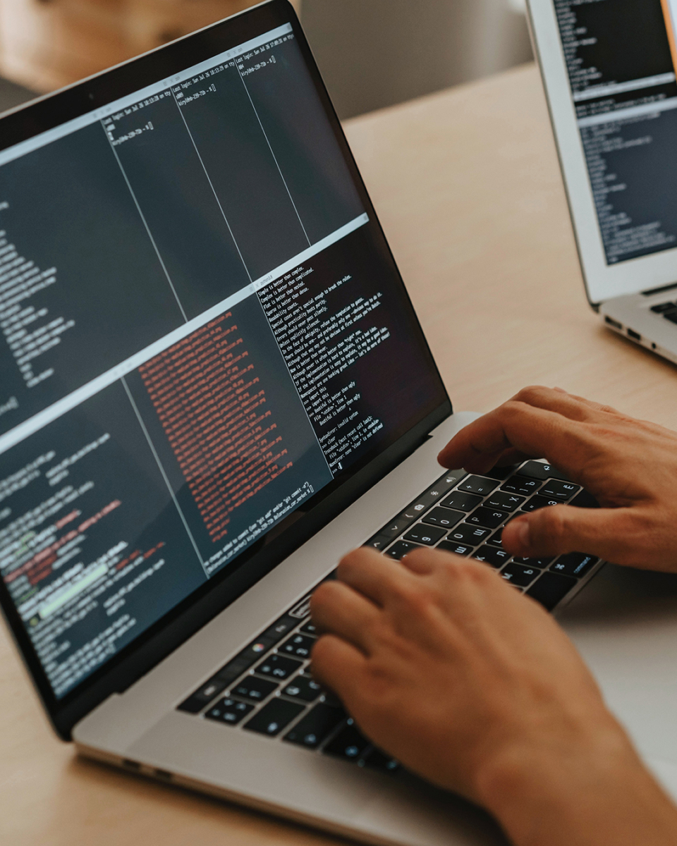
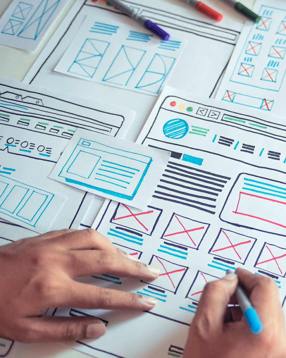
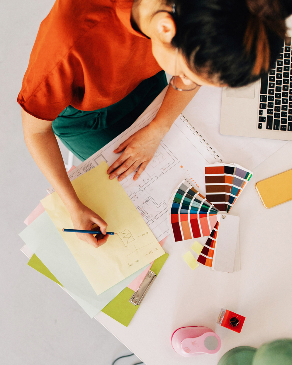
We want to communicate the satisfaction and happiness of starting or finishing a great project.


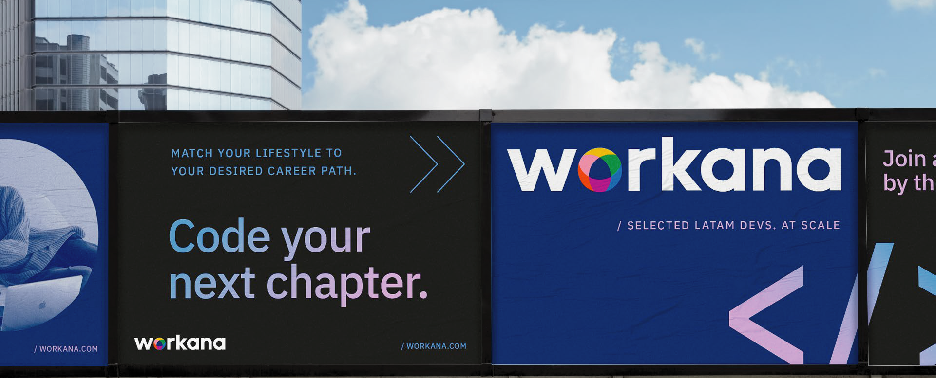
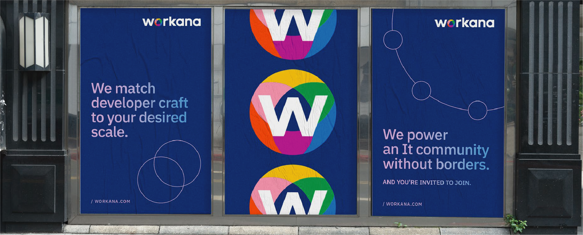
Let's bring all these together in some real execution examples.
We can play with the brand's elements to generate expressive and playful visuals
You can also build patterns with the morphology of the chromatic circle as a base.
Compositions based on the circle. Complete or in halves, both are valid to generate playful and dynamic visuals.
Assembly architecture for graphic and digital pieces.
In order to create more playful compositions, you can combine different circles of diverse sizes & shapes.
We encourage you to mix different styles of
images in the composition.
For example, You can use a close up or a texture detail alongside a ortrait of a user. By doing
this, we present a glimpse of the Workana universe.
When combining image & text, you can use slight overlaps of images & typography in order to give more dynamic to the composition, as long as they have enough contraste within each other.
We hope you find these guidelines useful, and please try to respect so we can mantain an effective and strong system in all communications.
 Toolkit SS Platform